Project Info
Category
Date
Viral “Muslim Majority in European Schools” Chart Found to Be Misleading and Unsupported
The Claim
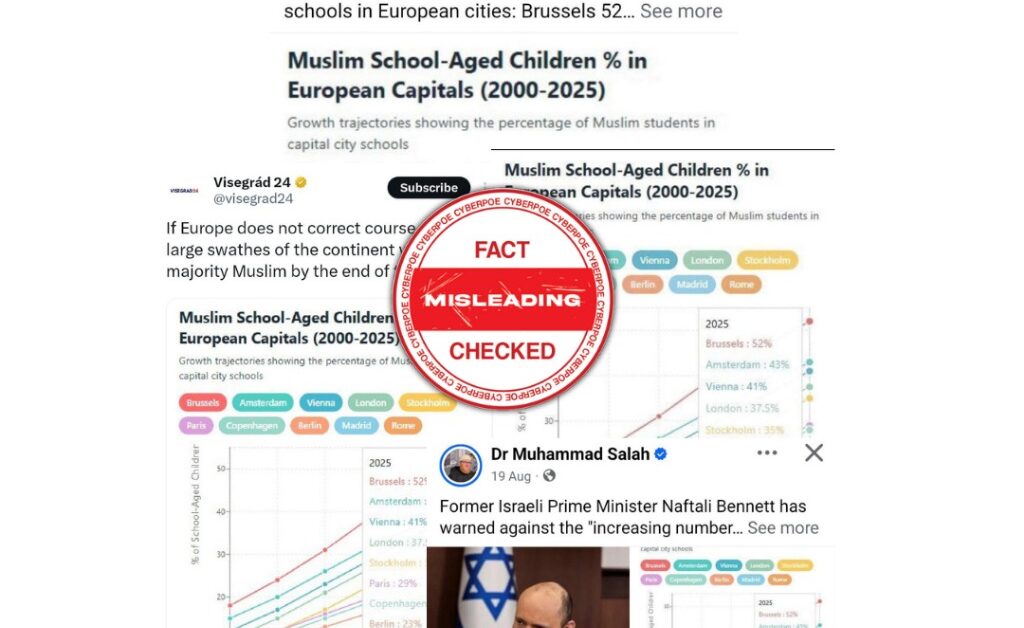
A viral chart circulating across X, Facebook, and Telegram claims that Muslim children now make up a majority of school-aged populations in several major European capitals with alleged figures like Brussels 52%, Paris 45%, and London 39%. The chart, styled to appear as an official demographic infographic, further implies that Europe is “on track to become primarily Muslim within 100 years.” The image was shared widely by political influencers and accounts known for anti-immigrant narratives. However, closer examination reveals that the data is grossly exaggerated, poorly sourced, and in several cases entirely fabricated.
The Investigation
CyberPoe’s review found that the supposed sources listed in the graphic either do not exist or were falsely attributed. One individual named as a contributor publicly stated he had no involvement whatsoever and had never seen the chart before. The organization responsible for the initial post operating under the name Shirion Collective has no known academic or statistical background and failed to provide any methodology, dataset, or source material to support its claims when questioned by independent analysts.
A closer digital forensic review of the chart’s image showed inconsistencies in font embedding, metadata timestamps, and visual layering suggesting it was digitally composed from multiple unrelated datasets or generated with assistance from AI design tools to mimic the style of authentic research infographics.
The Data Reality
Across all cities listed in the viral post, none of the figures align with known demographic data. Countries like Belgium and France, whose capitals (Brussels and Paris) are featured with the highest claimed percentages, do not officially collect data on citizens’ or students’ religious affiliations making such precise religious breakdowns statistically impossible to verify.
In London, government education reports do not record religion as a primary enrollment criterion, though some independent schools note approximate diversity figures. Those figures vary dramatically by district and never approach the 30–40% Muslim majority depicted in the viral chart.
Where religion-based data does exist such as select Vienna district surveys the proportion of Muslim students can be higher than the general population average but still falls short of the exaggerated “majority” claims made in the graphic.
Demographers and population analysts contacted by multiple fact-checking initiatives emphasize that projecting “religious majority trends” without transparent definitions, national census data, or time-series modeling is inherently unreliable. The viral chart offers none of these critical elements.
Broader Context
This incident is part of a recurring pattern in European social media spaces, where misleading demographic graphics are used to stir anxieties about migration, identity, and religious coexistence. Such misinformation leverages emotionally charged imagery especially involving children to suggest a cultural transformation that is imminent and uncontrollable.
CyberPoe’s assessment indicates that the intent behind the chart’s circulation aligns with previous coordinated disinformation efforts: framing European diversity as a “replacement” rather than as demographic evolution. The graphic’s design, tone, and selective referencing of fabricated statistics echo known propaganda strategies where pseudo-scientific data is used to legitimize xenophobic narratives.
Why It Matters
Demographic manipulation is one of the most effective modern propaganda tools because it appears objective while concealing bias. Charts like these exploit public trust in numbers and “data visuals,” giving falsehoods a veneer of authority. The danger lies in how easily such claims travel influencing perceptions, policy debates, and even election rhetoric long before they are corrected.
Unchecked, these distortions contribute to polarization, fear-based politics, and rising hostility toward Muslim communities. The weaponization of statistics not only undermines genuine academic work but also erodes public confidence in legitimate demographic institutions.
The Verdict
There is no verifiable evidence that Muslim children form a majority in any major European capital. Most of the data cited in the viral graphic is unverifiable, exaggerated, or outright invented. No European state collects religion-based student statistics at a national scale, making these numbers speculative at best and manipulative at worst.
The claim that “Europe will be primarily Muslim within 100 years” is baseless it reflects ideological projection, not empirical analysis. The chart is an engineered hoax designed to amplify division under the guise of data-driven concern.
CyberPoe Rating: 🔴 False / Misleading Data
Conclusion: The viral “Muslim majority” chart is a data fabrication presented as research, circulated as propaganda. Treat with zero credibility and rely only on transparent, verifiable demographic sources.
CyberPoe | The Anti-Propaganda Frontline 🌍


